Tuesday, May 31, 2011

The Fountain

 
This piece by the father of Dada, Marcel Duchamp can be seen at the Philadelphia Museum of Art. The purpose of this piece was to react against the absurdities of society. Duchamp felt the Great War was stupid and pointless. The dada movement allowed artists to express themselves freely. With the Fountain, Duchamp got rid of the academia conventions like Bosch and Caravaggio.

I chose this piece because I feel that artists should always be able to freely express themselves and not fear critique. I first thought that this was not art but with the art history class I soon learned the true purpose behind this piece and have learned to embrace its true meaning. Duchamp’s way of getting peoples’ attention was by creating some this absurd and he served his purpose with this piece. His point was made in a very direct manner with this piece and this is why I added it to the collection.

Autumn Rhythm Number 30

 
This piece is by Jackson Pollock and is part of the Color Field movement. He’s considered an avant-garde American artist. When he first began to pain the formed part of the New York School. All of his pieces depict his state of mind because he’s an abstract artist. This piece is gestural abstract expressionism. Gestural expressionism expresses energy and vitality. It’s solely chromatic because there is no actual item being represented but rather is just based on color.

Although I am not a fan of modern art, I chose this piece because the only time I enjoy modern art if it can be used as decorative. This piece is only chromatic and does not depict anything which is why I like it. If I’m going to display art in my home I rather it be chromatic and not depict something unless it’s a photograph. This piece expresses the artist feelings, and I liked the fact that he was able to express himself.

Bird in Space

 
Bird in Space by Brancusi is displayed in the Museum of Modern Art in New York. He was a Romanian artist and wanted to capture the essence of things as he did with this sculpture. He’s attempting to capture the action of the bird itself. The piece represents the essence of flight, and chose this particular shape to do it.

I enjoy looking at this piece because of its simplicity. It’s smooth and clean, and I can understand why Brancusi named the piece Bird in Space. I can imagine in my mind an actual bird in space, but Brancusi’s interpretation looks much more futuristic. I chose it for my collection because it’s simple.

Composition with Red, Blue, and Yellow

 
Mondrian’s Composition with Red, Blue and Yellow is currently in a private collection. Mondrian was part of the De Stijl movement and was the founder. The style revealed the underlying eternal structure of existence. Members of the movement wanted to stay close to simple shapes because they didn’t want to recreate something in nature, and that technique is called pure plastic. Mondrian used the primary colors, and simple horizontal and vertical lines. The only way they could create dynamism was through the different sizes and colors.

Before art history I had never heard of Mondrian but had seen his patterns in fashion magazines. I chose one of his pieces for my collection because I’m an avid reader of fashion magazines and being able to include a piece that involves fashion is fun for me. I also like the fact that the De Stijl movement was very simple and clean which in a way represents who I am.

The Scream

 
I first stumbled upon Munch’s piece my freshman year in honors world history. I had seen the Scream many times before art history and once I learned what the piece was about I liked it even more. Munch was a Scandinavian artist and part of the symbolists. He conveys the figure’s emotion in to the viewer which is how he makes his point. The shape of the figure is reinterpreted in the background. The purpose of this piece for Munch was to describe his personal fears. This piece is being displayed at the National Gallery located in Oslo, Norway.

I chose this piece because I felt that it could still be relevant in today’s society. What I like about this piece is the long brush stokes Munch used and how he reincorporated the figure into the background. Furthermore, I felt that the message was well conveyed because of the expression and emotion. 

Marriage a la Mode

 
Hogarth’s Marriage a la Mode, also known as the Breakfast Scene is located in the National Gallery in London. The piece is a satire on British Society. Hogarth was known for his satiric paintings based on English society. He placed religious figurines on the fireplace. Furthermore, he tackles the morality issues by showing the men can only be in on room, the account shown seems to give up on the couple feeling they are careless and irresponsible. The piece is somewhat painterly while remaining detailed at the same time.

This last year, I have learn many things about satires and have learned to love them which is why I decided to include this piece. Being able to understand the satiric elements helped me in understanding Hogarth’s intentional message with this piece rather than the one on the surface.

Lady Liberty Leading the People

 
Delacroix’s Lady Liberty Leading the People is currently on display at the Louvre in Paris. This piece is Romantic because it deals with patriotism. We have a reference to Amazonian women by the uncovering of Lady Liberty’s breast. It was meant to commemorate the July Revolution of 1830 in France. The bodies surrounding her represent the injustices. The church of Notre Dame is in the background as if the church was simply sitting back and watching the city’s destruction because the church always sides with who’s in power. The piece also serves as the main image in Les Miserable’s.

Now I know I’ve stated before, “this is my favorite because…” but to be sincere, this piece is among my top five pieces because of its message. I also liked this piece from the moment we began to study it in class because it happens to be the album cover for Coldplay’s Viva la Vida!. The pieces overall look is dramatic and somehow reminds me of Nike of Samothrace with the drama and movement occurring.

The Milk Maid

 
The Milkmaid by Vermeer is currently being displayed in the Rijksmuseum in Amsterdam. Vermeer was known for voyeurism, meaning that the viewer is interrupting and looking into a scene. Is depicts a moment in time, and there is only one direction of light which is typical of Vermeer. The theme relates to domestic life. He often used a yellow and blue color pallet which are complimentary to each other on the color wheel. His women are often soft spoken and his pieces give a sense tranquility to the viewer.

Vermeer is one of my favorite artists and I particularly like the fact that he uses the same color pallet and gives tranquility to the viewer. I also enjoy his pieces because there’s only one direction of light, the themes are always the same, and because the viewer is interrupting the scene. He is predictable which has led me to really enjoy his works.

Madonna with the Gold Finch

 
This piece by Raphael is currently located in Galleria degli Uffizi in Florence, Italy. He used the pyramidal composition with the three central figures, which he learned from Leonardo. The manner in which nature is depicted is typical of 16th century art in Italy and differs from that of Northern Europe because it’s much more simple and less realistic. He also uses sfumato to decrease the visibility of the perspective. It is typical of Raphael because of the woman and other figures’ soft features. Lastly, he concentrated on religious themes unless they were frescoes.

I decided to go with this piece because I feel that Raphael is undermined as an artist. People often pick Leonardo or Michelangelo but I feel that Raphael was just as competent. I enjoy his works more because of his soft delicate features. I also feel that the piece represents the Renaissance well because there are three main figures together in a triangle which is composed of three sides. It represents the most important number during the Renaissance because it demonstrates balance within the piece which is why I decided to add it on to my collection.

Birth of Venus

 
This piece is called the Birth of Venus and was painted by Botticelli and is currently being displayed in Galleria delgi Uffizi in Florence Italy. The theme is mythological rather than religious. It’s from the beginning of the Renaissance. He’s bringing back the nude. The action is taking place in the foreground, the background is simple. The sky and water aren’t realistic. We know this piece is by Botticelli because of the strawberry blonde hair, and soft facial features that were his conventions. It’s elegant and light but has a lack of emotion. He uses symbolism with the mythological god. He demonstrates the typical way of portraying nature in Italy during the 15th century.

I picked this piece for my collection because of Botticelli’s women. I found it interesting that his women were very similar, and that during this period women were depicted as strawberry blondes. Lastly, I like the fact that she is in the center of the piece not moving although Zephyr is blowing wind.

Arnolfini Marriage

 
This piece by Van Eyck is currently being displayed in the National Gallery located in London. The Arnolfini Marriage has an extreme amount of symbolism because it’s Northern European. As far as symbolism goes, the woman’s hairline represented her higher up bringing, the dog represents fidelity, the fruits represented wealth and fertility, the shoes represent domesticity. There is one vanishing point. This piece’s main significance is that it could be used as a legal document because it depicts the marriage occurring.

I first saw this piece in my European History class and never paid much attention to it until this year. I fell in love with it after going into depth during art history this last year. I love staring and the amount of detail Van Eyck used in this piece. I also adore the vibrant colors, and use of symbolism in Northern European art. I chose this piece for my collection because it is one of my five favorite pieces. It’s extremely realistic, and is also used as a legal document. What is there not to love about this piece?

Peaceful City

 
Lorenzetti’s Peaceful City is still displayed in the city of Sienna. The piece served as propaganda because at that time in Italy it was important to push forward the city-state because of the intense competition. It depicts the positive attributes of the city, everyone looks happy. In the background we can see watch towers, there’s an attempt at perspective with the size of buildings decreasing in the distance, meaning it is not quite linear perspective but rather stacked perspective. Lorenzetti was commissioned by the city to create a series of works that promoted Sienna; Peaceful City and Peaceful Country were among them.

I decided on adding Lorenzetti’s piece to my collection because it was one of the first propaganda pieces. Furthermore, I enjoy 14th Century Italian art because it wasn’t quiet the Renaissance but close enough that we begin to see the evolution of the arts at a much faster rater.  Moreover, unlike Northern European art from this period, the colors are not as vibrant and are primarily frescoes. It’s appealing to the eye because of how the figures within the piece are portrayed.

Saint Chapelle

 
Saint Chapelle is a church built during the high Gothic period. It’s often known as the Gothic Jewel. It was built during Louis IX reign in order to serve as the royal family’s chapel and to store their jewels. Saint Chapelle is located the right side of Paris’s Seine river. It is well known for it’s enormous and extremely ornate stain glass windows. The stained glass windows are flamboyant. They start from the floor up.

Although I did not see Saint Chapelle’s interior during my trip to Paris, I was fortunate to see the exterior. I liked the fact that Paris was full of churches, yet its exterior stood out in my mind because of its size. It’s not large but still makes a statement. I chose it because of its lasting impression and its extremely ornate, jaw-dropping interior.

Saint Matthew Lindisfarne Gospel

 
The Saint Matthew Lindisfarne Gospel is currently being displayed in the British Library located in London. In this piece we see Saint Mathew writing a book. His feet seem like they are floating which was a convention tracing back from the Byzantium period. The drapery is rigid and he seems to be detached from the background. We also see a second figure in the back peaking through the curtain. The story behind this depicting was that an angel had told Mathew to write the book.

I decided on this piece because I enjoy analyzing different carpet pages. I also enjoyed studying this period due to the illuminated manuscripts which I first came across during my trip to the LA Getty Museum during my Freshman year. I also enjoy looking at the Latin written in the Gospels because what we now have are printed texts in our vernacular language and not one that is common for every region.

Dome of the Rock

 
Perhaps one of the most important religious buildings in the world, the Dome of the Rock is located in Jerusalem. The reason why I said that it can be one of the most important religious buildings in the world is because the three main religions (Christianity, Judaism, and Islam) have a piece of their religion within the building. It was a great achievement for the 7th century, which was shortly after Mohammed returned from the Medina. Christians consider it to be the burial site of Adam. For the Jewish, it is the place where Isaac  almost sacrificed his son and the grounds of the Temple of Solomon. For Muslims, it is the place where Mohammed ascended to Heaven. The dome of the Rock is reminiscent of the dome of San Vitale. Its dome covered in gold leaf, the bottom of the building consisting of different marbles, and the upper section consisting of glazed tiles, similar to the lapis lazuli tiles from the Ishtar Gate. The motifs are geometric and arabesque with writings from the Qur’an.

The Dome of the Rock is a symbol for three of the world’s main religions which I find to be fascinated. I felt that because the Dome plays such an important role in these religions that I had to include it in my collection. I love the detail in the façade and the arabesque feature. I also enjoy its reminiscence to the Ishtar Gate. Lastly, the fact that it’s not completed but still plays an important role astounds me.

Hagia Sophia

 
Hagia Sophia is currently located in what is now Constantinople. It was originally a Christian church but was later converted into a mosque and one can still see some of the original Christian images. Hagia Sophia was built on the pendative principle. It now contains the minaret to call Muslims into prayer. The gallery on the second level was dedicated to women. A convention from the Byzantine era, which was when Hagia Sophia was erected, is the floating effect the dome has. It was meant to give it a floating effect.

I often see images of Hagia Sophia but before this class I did not know the name of Hagia Sophia but was aware of its location. As I learned about it in art history class, I found it interesting that there is a mix in the architectural influences; Islamic and Byzantine. The gold and central plan characteristics of the Byzantine and the minaret, the arabesque caligraphy in the interior.

Colosseum

 
The Colosseum is located in Rome, Italy. It consists of four levels; each becoming shorter as it goes higher. Furthermore, the density of the walls decrease the higher you go in order to support the weight of the concrete. It is composed of four different orders; the Doric order is used in the first level, Ionic in the second, Corinthian in the third, and lastly, composite in the fourth level. The purpose of the building was to serve as an entertainment stadium and is based on the system of the round arch.

I decided to pick the Colosseum in my collection of paintings, sculptures, and buildings because it influenced the design and construction of many buildings throughout history, such as those from the renaissance because with each level, their height decreased. I also appreciate the fact that we can observe four different orders all in one building.

Nike of Samothrace

 
Nike of Samothrace is currently displayed at the Louvre museum in Paris, France. She is a perfect conveyor of the Greek Hellenistic conventions. She represents victory, which is why the brand Nike has a “V” as their logo. The artistic depicted the wind breaking into her wing with extreme drama, which was typically of the Hellenistic conventions. Along with the drama captured in her wings are also the dramatic folds in the drapery. If viewed from the side, we can further see the amount of drama in the wings. Moreover, the contrapposto is displayed in a more dramatic manner.

I selected Nike because it was the first piece I saw when I entered the Louvre. Her presence at the top of the staircase was astounding. She left a permanent impression in my mind because of her size and drama. Upon learning about her in class, she remained on of my favorite sculptures in the course of Art History.

Wednesday, May 25, 2011

Les Invalides

 
Les Invalides was designed by Hardouin-Mansart. The church is attached to the veterans’ hospital established by Louis XIV. It’s was built during the Baroque period. We can tell it is a Baroque building because there are an even number of levels, and columns. There are more than three levels, there are several elements put together. The façade protrudes, which was a typical convention in Baroque architecture. Furthermore, the dome is ornate, and with the use of gold also adds to the Baroque characteristics; it is reminiscent to Saint Peter’s dome, and the top of the dome is reminiscent of the Saint Ivo Chapel.

While in Paris, I became obsessed with the church, unaware of its name or origin. My obsession resulted in having approximately 200 photos in different angels of the church. Upon learning about Les Invalides in class, I was ecstatic and when I learned about this project I knew I had to included it in my collection. I enjoy staring at the amount of details and gold the church dome has. It’s my favorite element of the church. If I were to have to pick a favorite building I study this last year, I would pick Les Invalides because of the general impression it left me in person.

Monday, May 23, 2011

Ophelia

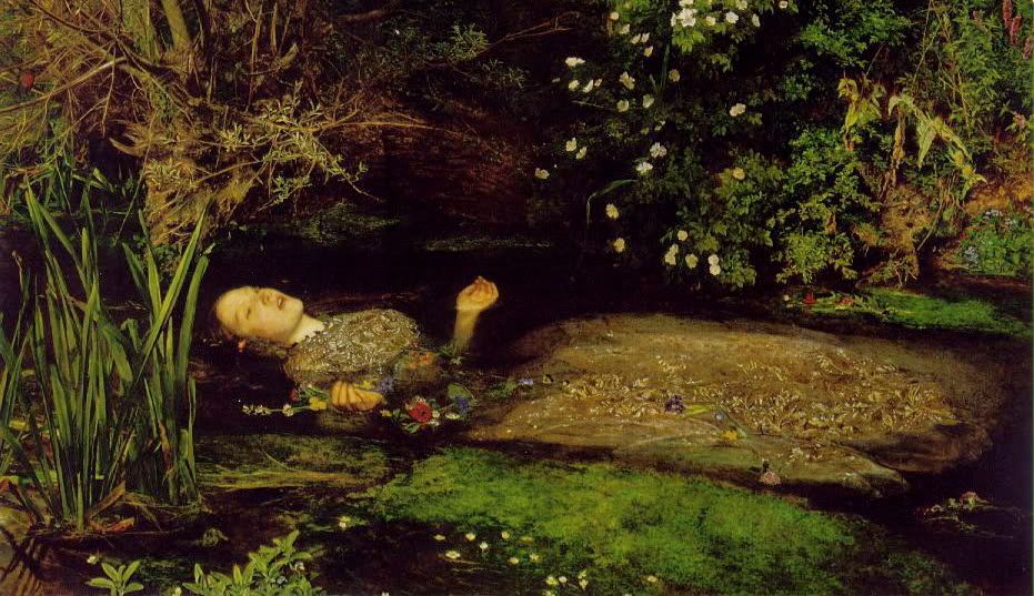
This piece was created by the English artist John Millais. He formed a part of the Pre-Raphaelites, who rejected Raphael’s painting techniques which included delicate details. They wanted to go back to the artistic conventions that came before him. The movement was against the industrialization during the era. Millais used Shakespeare’s Hamlet as an inspiration for this piece. Millais, like many of the Pre-Raphaelite artists went back to subjects that involved courtly love and chivalry, which originated during the middle ages. Certain elements of Millais’s Ophelia are reminiscent of Durer’s detail when depicting nature. The details of nature are extremely detailed in this piece because of the influences. Her face and hands are realistic yet her dress is painterly.

I picked this piece for a variety of reasons. The first is that Hamlet is one of my favorite Shakespearean plays. Secondly, I enjoy observing the transition of details and brush strokes in the piece, from extremely minute to painterly. Furthermore, the depiction of nature is intriguing to me. The piece is exhibited in the Tate Gallery located in London. 

Thursday, May 19, 2011

Las Meninas

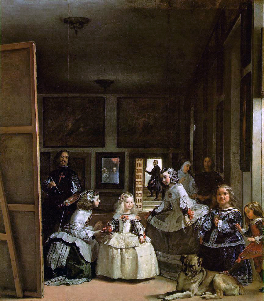
Las Meninas was created by Diego Velázquez during the Baroque period. He was the Philip IV of Spain's artist. In this piece he depicts la infanta, who is the King's daughter. The piece is an example of a Baroque piece. The Baroque conventions typically included a moment in time, drama (often used with different lighting effects, or tenebrism) it's on a stage, and exaggeration. We see drama and a moment in time with this piece. The infanta is in the center and is highlighted with a greater amount of light because she is the most important figure. We see that she is being attended by her servants who were little people (they made her feel more comfortable because of their size). What is different about this piece is that Velázquez includes himself in the painting with. Furthermore, we have multiple realties in this piece, la infanta is in the center, in the very back we have a mirror in which we can see the King and Queen, and on the back of the viewer's right we see the nuns running.

This piece is one of my favorite for the Baroque period primarily because of the multiple realities. Furthermore, there is not as much drama depicted like in Caravaggio's pieces. The tenebrism (drama with light or expression) isn't as evident. I also like the fact that although Spain during this period was more religious but isn't directly shown within the piece except for the nun. Lastly, I enjoy observing this piece because I learned about the Spanish monarchy, and I first came across the technical term for the King's daughter, la infanta.